Case Study 03/04 · FoodTech
AirbaFresh
A grocery delivery app where building a basket was slower than the delivery itself.
Fast delivery, slow shopping
The app's whole promise was speed — but building a basket from scratch, inventing a diet plan and searching for 20+ individual items, took 4–5 minutes on average. For a "fast delivery" app, the shopping experience itself was the bottleneck.
Understand the basket before redesigning it
Rather than guessing at a fix, I ran in-app surveys and interviews to uncover real shopping habits: what diets people followed, which cuisines they cooked most often, and how their needs shifted with the seasons. The goal was to find the handful of shopping patterns that could replace dozens of individual searches.
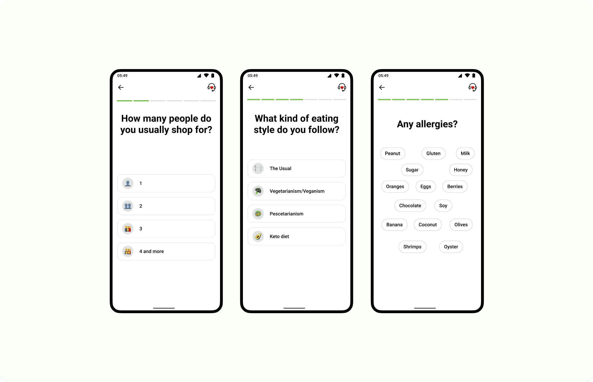
The onboarding survey used to learn diet, household size, and allergies up front
Designing ready-made collections
The research findings turned into curated, ready-made collections that stood in for the searches people repeated every week:
- Healthy nutrition packs.
- National cuisine sets — e.g. Georgian dishes.
- Lifestyle-based baskets — vegetarian, keto, family meals.
With attractive visuals and curated lists front and center, users could shop in a couple of taps instead of repeating the same searches every time.
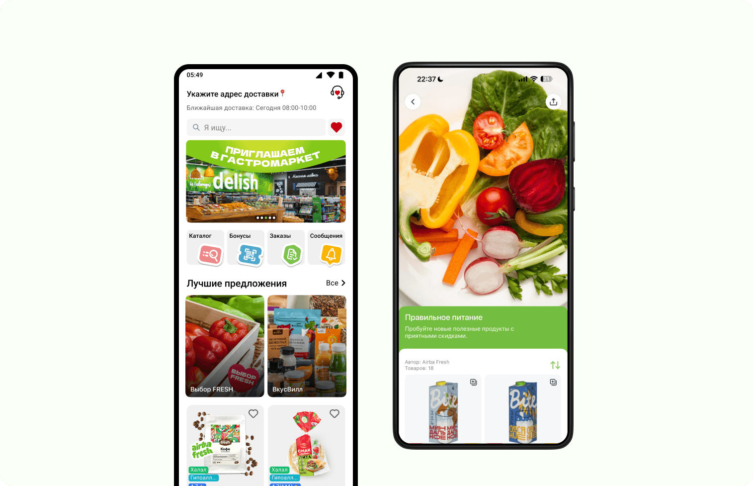
Home screen & the "Healthy Nutrition" collection
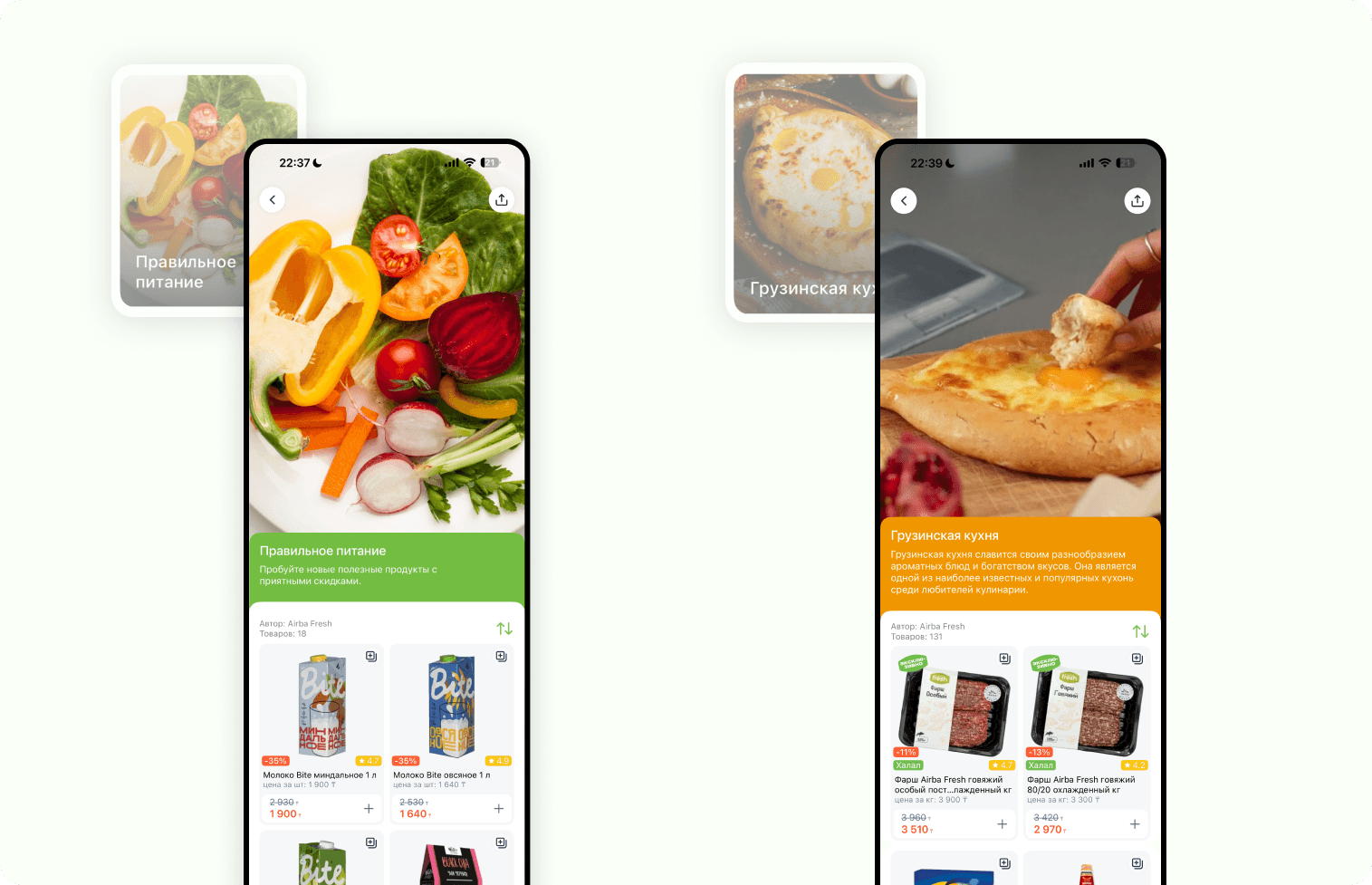
"Healthy Nutrition" & "Georgian Cuisine" collections
Minutes back, a signature feature
Within the first year of launch, across both the offline market and the online app
- Collections became the app's signature feature, loved by users.
- Users discovered new products they wouldn't have found in a long catalog.
One identity, on the shelf and on the screen
AirbaFresh isn't only an app — the same visual identity carries through a physical grocery market, its marketing campaigns, and the brand guidelines that keep all of it consistent.
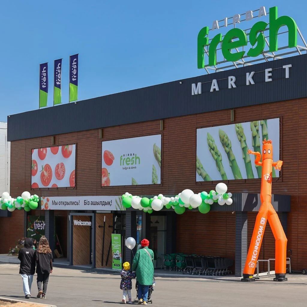
The AirbaFresh Market storefront, on opening day
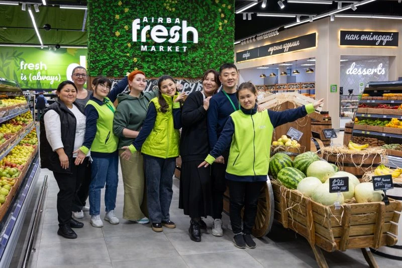
Inside the market — same brand, same shade of green
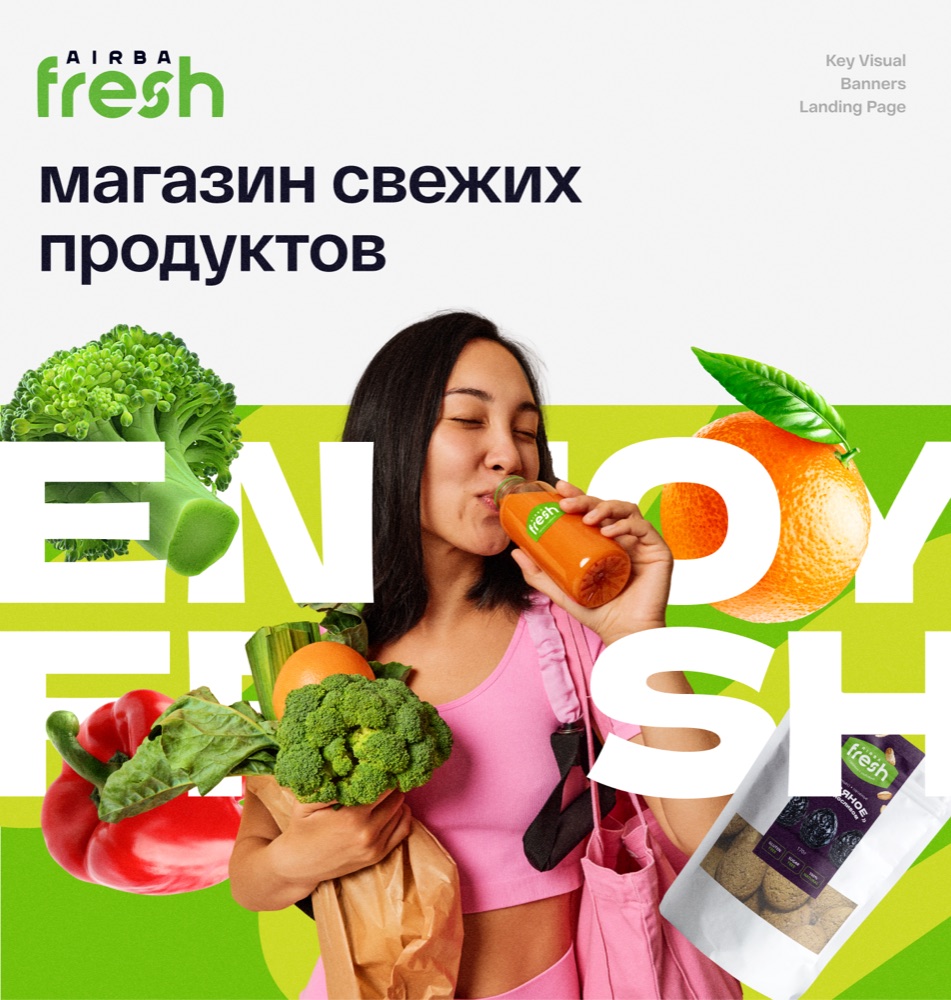
Key visual for the "Enjoy Fresh" campaign
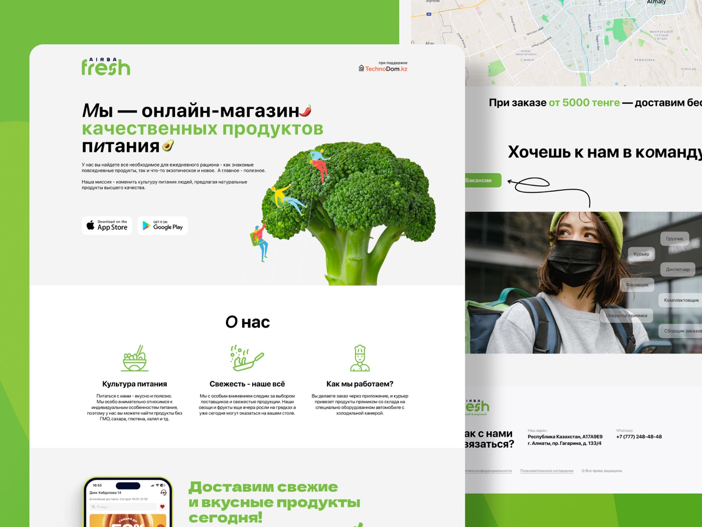
The marketing site, same identity carried through
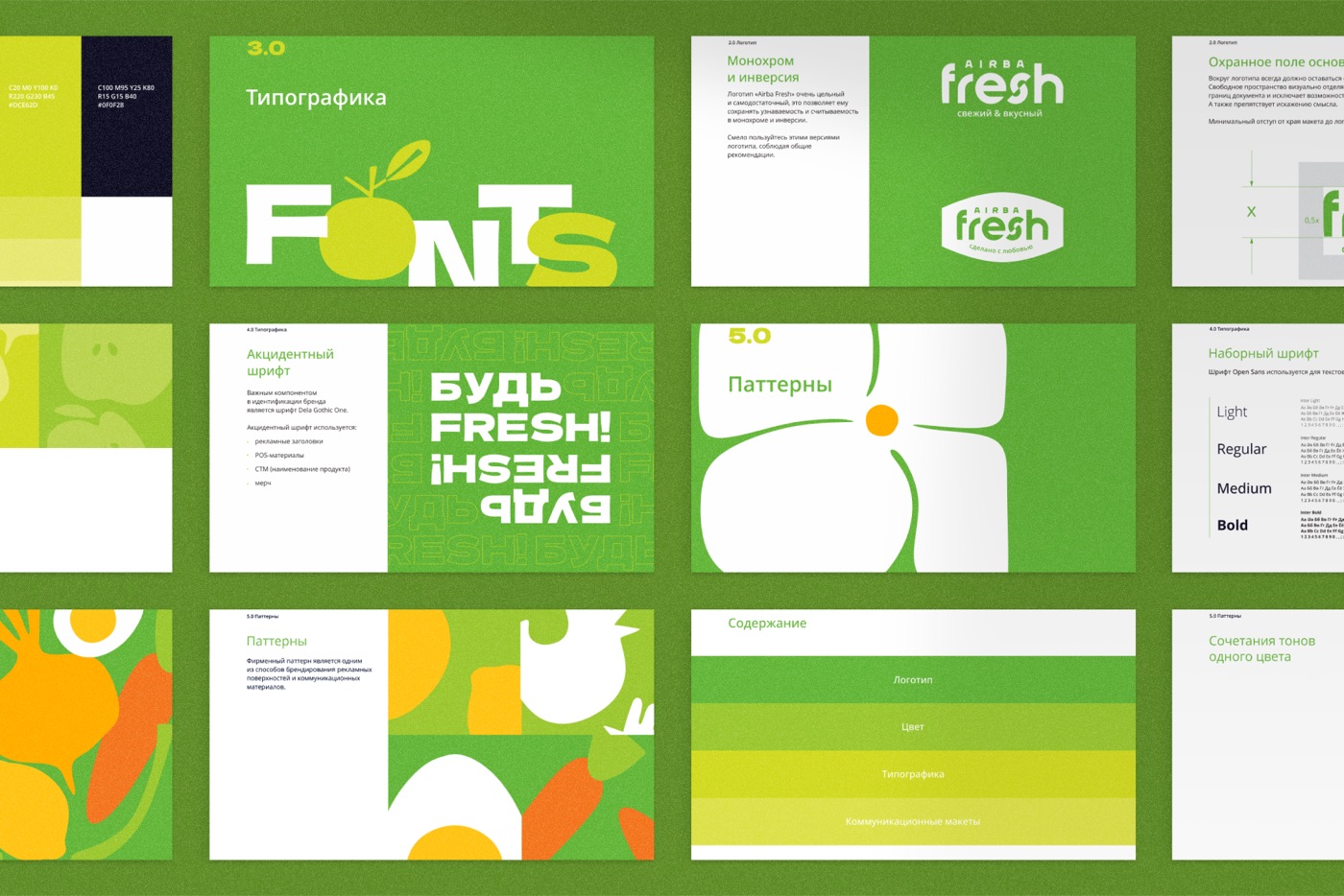
Pages from the brand guidelines — color, typography, logo rules, and patterns