Case Study 02/04 · Design System
Design System — Unified Library
Scaling Consistency Across Products — one source of truth for a fragmented product ecosystem.
One bank, forty different buttons
Two departments — individual banking and business owners — split across roughly 40 product teams spanning mobile, desktop, and internal services. Every team was designing on its own: buttons looked different, typography shifted from product to product, and developers often rebuilt the same component from scratch. It slowed everyone down and confused users moving between products that were supposed to feel like one bank.
My first task on the 7-person DS team was running the design audit that quantified this: cataloguing components across both departments, in Figma and in what had actually shipped in code.
Approximate — from the initial cross-department audit
That drift wasn't carelessness — it was teams quietly hardcoding components because the shared library didn't cover what their product owner needed.
Start with agreement, not components
Core existed to shorten the time it took to make any kind of change. Instead of updating the same button in five different files, a change was made once, in one source — Core — and synced out to every product on the platform from there.
Before drawing a single button, the priority was getting design and engineering to agree on a shared vocabulary. I proposed an atomic structure — tokens, atoms, molecules, components, organisms, and patterns — so both disciplines could point at the same layer and mean the same thing.
Tokens were a team decision — I was one of the core contributors on color, typography, spacing, and effects.
For the numeric tokens (spacing, sizing), we used a scale that skips numbers — 50, 100, 200, 300, 400 — instead of counting 1, 2, 3, 4. That gap between steps was deliberate:
When a product genuinely needed a value between two steps — like 150 between 100 and 200 — it slotted in without renaming anything above it.
Governance was treated as part of the design work itself, not an afterthought: who could propose a new component, how a change would migrate across live products, and how teams outside the core group could contribute back.
Building Core, layer by layer
- Defined tokens first (color, spacing, type, effects) as a team, so every layer above inherited the same foundation — I contributed to and cross-checked this layer against live products.
- Built atoms and molecules, then assembled them into components, organisms and full patterns.
- Wrote governance rules and a migration process so existing products could adopt Core without a full rebuild.
- Opened a contribution path so product teams could propose additions instead of forking their own components.
Part of the library
A slice of Core in practice — charts, financial widgets, badges, checkboxes, empty states — built from the same tokens and structure, reused across products instead of rebuilt per team.
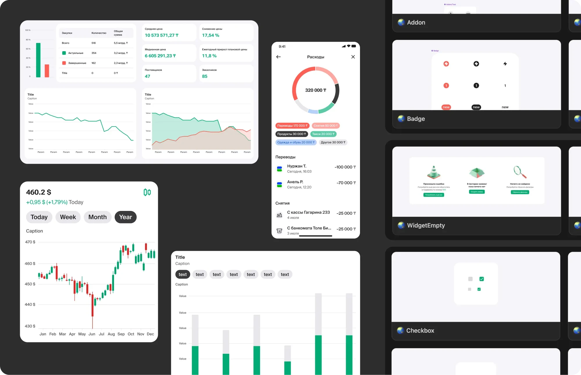
Charts, financial widgets, badges, checkboxes and empty states, all pulled from the same Core library
How one component became two
Every mobile and desktop component pulled its base from Core, then tailored it for the platform — same logic, same tokens, different shell.
When developers went around the system
Conflict
Even with a contribution path open, developers kept hardcoding components when the library didn't cover an edge case their product owner needed on a deadline — common enough across ~40 teams that it became a recurring meeting. Being embedded in the junior banking product myself, and knowing Core from the DS side, meant I could sit in those calls and translate both ways: assess whether the request was a real gap in Core or a one-off, then propose a version that solved the product's problem without forking the component.
Keeping Core alive, not just launched
feat/ds-*, fix/ds-*, chore/ds-*, deprecated/ds-*🟢 Core · Buttons · v2 · @muslima. 🟢 ready to dev, 🟡 in review, ⚫️ archived — legible at a glance, no need to check Jira.What changed
Approximate, adjusted for confidentiality
Components (consolidated from near-duplicates)
Design-to-dev drift
To check whether Core actually helped day to day, I timed product designers building the same screen two ways in Figma: once with the Core component library, once with one-off, legacy elements.
Time for a product designer to build a screen
Without the component library, building the same screen took roughly 2.5x longer.
Core is now the shared library every product team builds from, instead of a set of guidelines teams quietly worked around. Designers and developers use the same components, with the same names, and don't have to double-check whether a screen was built from the real library or a one-off copy.